Layout with Tailwind CSS
A typical layout of administration console app has three parts, the top navigation bar, the left side menu bar and the main content area.
|------------------------------------------------------|
|                    Top Navigation Bar                |
|------------------------------------------------------|
|                    |                                 |
|                    |                                 |
|                    |                                 |
|   Left Side Menu   |        Main Content Area        |
|                    |                                 |
|                    |                                 |
|                    |                                 |
|------------------------------------------------------|
Create layout component
Firstly, create layouts directory under src, and create Main.vue file in layouts.
src/layouts/Main.vue
<template>
    <slot />
</template>
Then, import main layout into App.vue, and replace the content of template with MainLayout element.
src/App.vue
<script setup>
    import MainLayout from './layouts/Main.vue';
</script>

<template>
    <MainLayout>
        <h1 class="underline text-red-500 text-3xl">Main Layout</h1>
    </MainLayout>
</template>
Now, you can execute npm run dev again and get page preview like this.
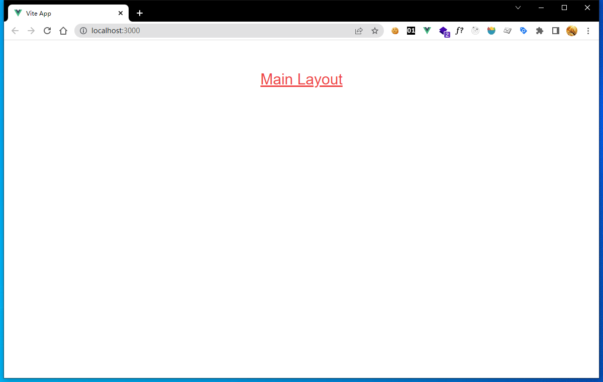
2-1
Add top navigation bar
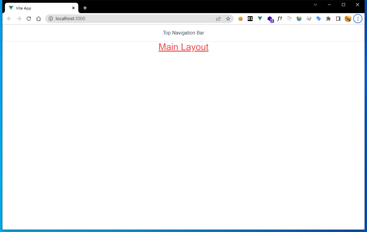
Create file NavBar.vue in components, and edit the file content.
src/components/NavBar.vue
<template>
    <div class="flex items-center justify-center border h-14">Top Navigation Bar</div>
</template>
Here, we use flex layout, which is easy to use and supported by by most popular browsers.
class items-center makes child elements positioned on the center of a container's cross axis, here is vertical center.
class justify-center makes child elements aligned along their inline axis, here is horizontal center.
class border show the border of top navigation bar, that we can know the position easily.
class h-14 makes the height of top navigation bar 3.5rem; /* 56px */.
Then, add the component to main layout.
src/layouts/Main.vue
<template>
    <NavBar />
    <slot />
</template>
<script>
    import NavBar from '../components/NavBar.vue';
    export default {
        components: { NavBar }
    };
</script>
After saved these changes, there will be an issue, that the top bar does not sticky on the top, there is a huge margin between them.

2-2
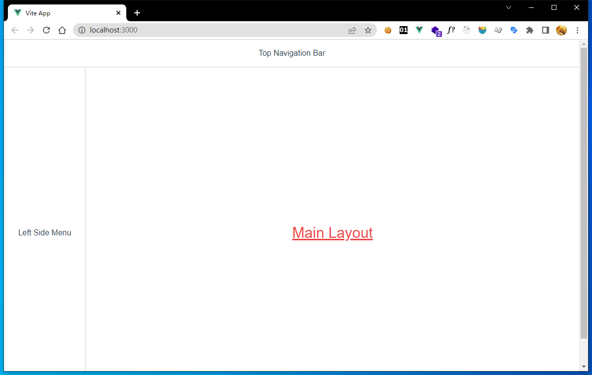
You should comment the line margin-top: 60px; in the file src/App.vue to disable the margin.
src/App.vue
/* margin-top: 60px; */
Now the page looks well, and be divided into two rows.
2-3
Divide an element into two columns
Before we create left side menu component, we should split the second row of current layout into two columns.We can using three div elements to achieve this.
src/layouts/Main.vue
<template>
    <NavBar />
    <div class="flex h-screen">
        <div class="flex w-48 border items-center justify-center">Left Side Menu</div>
        <div class="flex w-full justify-center items-center border">
            <slot />
        </div>
    </div>
</template>
...
class h-screen denote height: 100vh;, that makes the container element taking all the space below the top navigation bar;
class w-48 set the height of the left side menu to width: 12rem; /* 192px */.
class w-full makes the slot taking all the remaining space on the right side.
Now, we can preview the page,which had been divided into three parts, and looks well.
2-4
Add menu component
Create file Menu.vue in components, and edit the content.
src/components/Menu.vue
<template>
    <div class="flex w-48 border items-center justify-center">Left Side Menu</div>
</template>
Then, import Menu component into main layout, and replace the origin left side menu code with Menu component.
src/layouts/Main.vue
<template>
    <NavBar />
    <div class="flex h-screen">
        <menu />
        <div class="flex w-full justify-center items-center border">
            <slot />
        </div>
    </div>
</template>
<script>
    import NavBar from '../components/NavBar.vue';
    import Menu from '../components/Menu.vue';
    export default {
        components: { NavBar, Menu }
    };
</script>
Preview the page again, layout do not change, we just create a Menu component and wrap all the left side menu code there.
Unexpected scroll bar
You may noticed there is a vertical scroll bar, even we do not have much content on page yet.
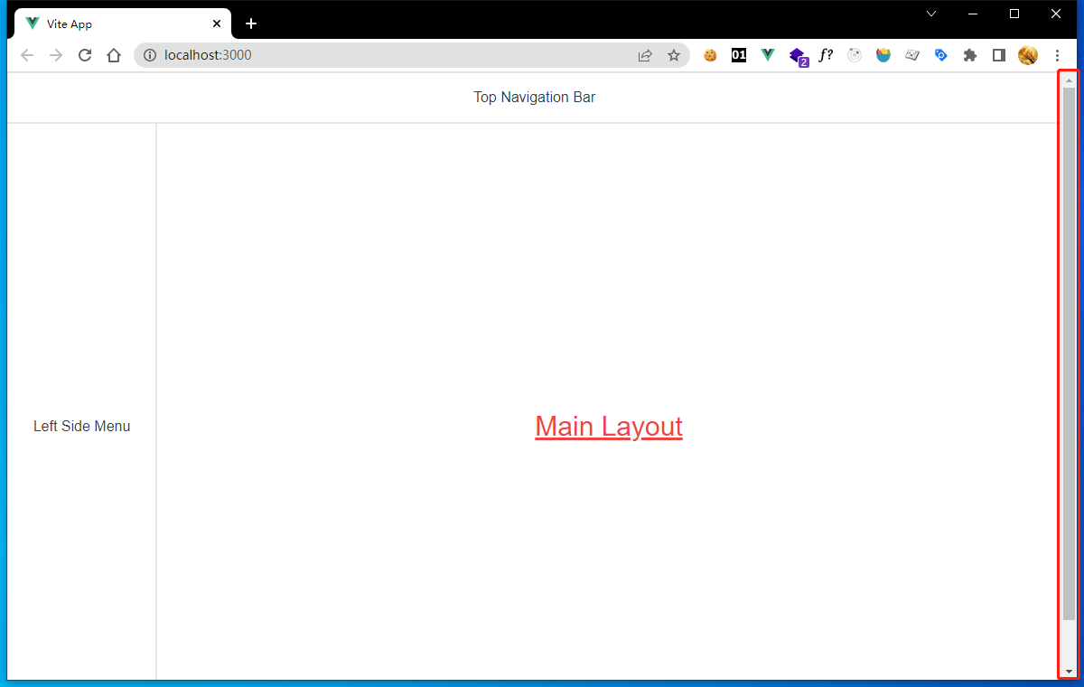
2-5
This is because we useh-screen class in the <div> tag which set the height of the element 100vh without setting the root div height. So page content overflow vertically.
Let's fixed it.
We should set root #app element's style in App.vue.
src/App.vue
#app {
  ...
  /* margin-top: 60px; */
  display: flex;
  flex-direction: column;
  height: 100vh;
}

2-6
Now the vertical scroll bar disappear, that's it.Finally, change unnecessary h-screen to h-full.
src/layouts/Main.vue
<template>
    <NavBar />
    <div class="flex h-full">
        <menu />
        <div class="flex w-full justify-center items-center border">
            <slot />
        </div>
    </div>
</template>
...