Custom Components with Tailwind CSS
Some UI framework provide out-of-the-box components like Element UI,Vuetify etc.It's very convenient and efficiency using OOTB framework, all you need to do is adding the components to your view, binding the data, adjusting the style.
Since we are using tailwindcss framework which is more lightweight and flexible. So we will take one more step in this tutotial, we create our own custom UI components start from native html element with the help of vue and tailwindcss.
Top Navigation Bar
We have created a NavBar component in Chapter 2, then we add more items to it.
Here is the general layout of a top navigation bar
|-----------------------------------------------------|
| Brand Name                        Nickname | Avatar |
|-----------------------------------------------------|
The Brand Name element float on the left , Nickname and Avatar element float on the right. All the elements align at the vertical center of the bar.
Now let's see how to achieve this layout.
src/components/NavBar.vue
<template>
  <div class="flex items-center justify-between border h-14">
    <div>Brand Name</div>
    <div>
      <span>Nickname</span>
      <div>Avatar</div>
    </div>
  </div>
</template>
Here, we removed Top Navigation Bar text, add two div and one span tag, replace justify-center with justify-between.
Run npm run dev and the page renderd as below:
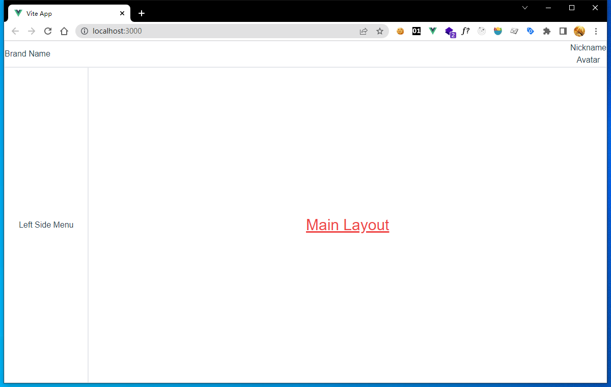
4-1
We can see Brand Name float on the left, Nickname and Avatar float on the right, almost what we want.The magic here is justify-between push its two children elements aside and fill space between them.
Then we add more details to NavBar:
src/components/NavBar.vue
<template>
  <div class="flex items-center justify-between border h-14 px-4 font-bold">
    <div>Brand Name</div>
    <div class="flex items-center gap-2">
      <span>Nickname</span>
      <div
        class="flex relative rounded-full border h-10 w-10 items-center justify-center text-xs"
      >
        <img src="../assets/logo.png" class="absolute h-8 w-8" />
        <span class="absolute">Avatar</span>
      </div>
    </div>
  </div>
</template>
What we do here is:
- Add padding space on the left and right side of the bar with
px-4 - Add
font-boldclass to make text in the bar bold and identical. - Add
flexandgap-2to arrange Nickname and Avatar elements in a row. - Add
imgelement to display the vue logo as avatar image. - Add
relativeandabsoluteclasses to make avatar text stack on top of image. - Some
h-xandw-xclasses setting heights and widths.
Press Ctrl+S key, and now the rendered page looks well:
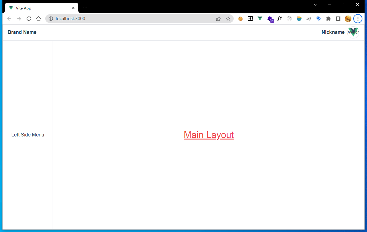
4-2
SVG Icon System
If you have a large project, you will realize that you need all kinds of icons to provide end users professional UI and you need a good management of those icons.
So, here we will create one SVG icon component, and wrap all those svg icon files designed by yourself or downloaded from other opensource libraries.
Create SVG Icon Wrapper
Create SvgIcon.vue in components folder, edit its content:
src/components/SvgIcon.vue
<template>
  <svg aria-hidden="true" class="fill-current">
    <use :href="symbolId" />
  </svg>
</template>

<script>
import { defineComponent, computed } from "vue";

export default defineComponent({
  name: "SvgIcon",
  props: {
    prefix: {
      type: String,
      default: "icon",
    },
    name: {
      type: String,
      required: true,
    },
  },
  setup(props) {
    const symbolId = computed(() => `#${props.prefix}-${props.name}`);
    return { symbolId };
  },
});
</script>
Here, you will be confused.Do not worry, here we defined the entry component or component wrapper.It has two props prefix and name, and concat them as symbolId.The symbolId represents a global component registered by a plugin we will introduce next step.
Register SVG Files
Here we use a vite plugin called vite-plugin-svg-icons that does the job well.
npm i vite-plugin-svg-icons -D
Then, config vite plugin.
vite.config.js
...
import { createSvgIconsPlugin } from "vite-plugin-svg-icons";
import path from "path";

export default defineConfig({
  plugins: [
    ...
    createSvgIconsPlugin({
      // Specify the icon folder to be cached
      iconDirs: [path.resolve(process.cwd(), "src/assets/icons")],
      // Specify symbolId format
      symbolId: "icon-[dir]-[name]",
    }),
  ],
  ...
});
The symbolId option here has the same format as SvgIcon component.
Next, introduce the registration script in src/main.js and register SvgIcon component globally.
src/main.js
import { createApp } from 'vue'
import App from './App.vue'
import "./index.css";
import "virtual:svg-icons-register";
import SvgIcon from "./components/SvgIcon.vue";

const app = createApp(App); // name the instance for subsequent config
app.component("SvgIcon", SvgIcon); // register component globally
app.mount("#app");
Finally, create folder src/assets/icons that we configed for iconDirs option in vite.config.js.
We can get icons from Google fonts:
Search arrow up download Keyboard Arrow Up with default Customization.
Search arrow down download Keyboard Arrow Down with default Customization.
Copy downloaded icons to folder src/assets/icons.
Use SVG Icons in Custom Components
If you have completed all the previous steps, it is easy to use SVG icons now.
Just copy SVG file name you want from icons folder, put it as SvgIcon component's name property.
Here we have an example:
src/App.vue
...
<template>
  <MainLayout>
    <h1 class="underline text-red-500 text-3xl">Main Layout</h1>
    <SvgIcon
      name="keyboard_arrow_down_FILL0_wght400_GRAD0_opsz48"
      class="text-red-500"
    />
  </MainLayout>
</template>
...
Run npm run dev, you can see rendered page:
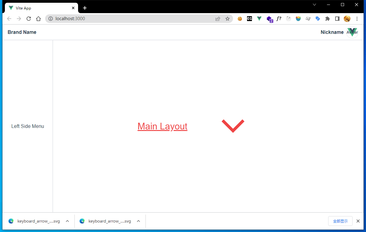
4-3
The Keyboard Arrow Down icon shows up with red color by adding text-red-500 class.
Side Menu
As usual, side menus have tree structure.
|--Item.1
|    |--Item.1.1
|    |--Item.1.2
|    |    |--Item.1.2.1
|    |    |--Item.1.2.2
|--Item.2
|    |--Item.2.1
|    |--Item.2.2
|    |    |--Item.2.2.1
|    |    |--Item.2.2.2
|--Item.3
|--Item.4
|--...
Extract Data
First, we extract data from the tree and fill in our component later.An object array is ideal data structure.
[
  {
    key: 'Item.1',
    label: 'Item.1',
    children: [
      { key: 'Item.1.1', label: 'Item.1.1', children: [] },
      {
        key: 'Item.1.2',
        label: 'Item.1.2',
        children: [
          { key: 'Item.1.2.1', label: 'Item.1.2.1', children: [] },
          { key: 'Item.1.2.2', label: 'Item.1.2.2', children: [] },
        ],
      },
    ],
  },
  {
    key: 'Item.2',
    label: 'Item.2',
    children: [
      { key: 'Item.2.1', label: 'Item.2.1', children: [] },
      {
        key: 'Item.2.2',
        label: 'Item.2.2',
        children: [
          { key: 'Item.2.2.1', label: 'Item.2.2.1', children: [] },
          { key: 'Item.2.2.2', label: 'Item.2.2.2', children: [] },
        ],
      },
    ],
  },
  { key: 'Item.3', label: 'Item.3', children: [] },
  { key: 'Item.4', label: 'Item.4', children: [] },
]
As you can see, the tree node has structure like:{ key: '', label: '', children: [] }.
keyis useful when we usev-forto create a list of component.labelis the display name of menu item.childrenis an array, store the child nodes which has the same node structure.
Create Menu and MenuItem
Next, we will create a common component called MenuItem which denote one menu item, then nesting itself to construct the menu tree.
src/components/MenuItem.vue
<template>
    <span>{{ itemData.label }}</span>
</template>
<script>
export default {
  name: 'MenuItem',
  props: {
    itemData: {
      type: Object,
      default: () => {
        return { key: 'default-key', label: 'Not Set', children: [] };
      },
    },
  },
};
</script>
Here we defined a simple component, that only has one props itemData with default value.
Then we add MenuItem to Menu component.
src/components/Menu.vue
<template>
  <div class="flex w-48 border items-center justify-center">
    <MenuItem />
  </div>
</template>
<script>
import MenuItem from './MenuItem.vue';
export default {
  components: { MenuItem },
};
</script>
Now execute npm run dev in your terminal, visit http://localhost:3000, you will see Not Set showed up at the left side.
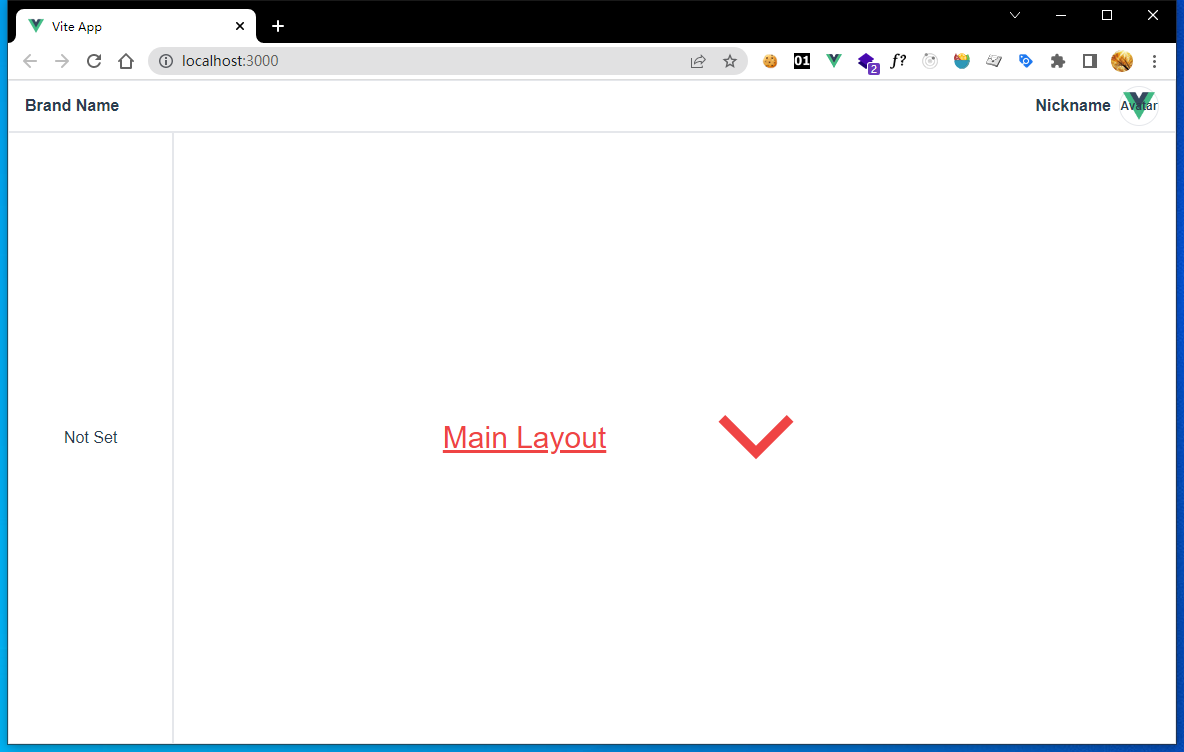
4-4
Then we add a props property named menuData, and set previously extracted data as its default value.
src/components/Menu.vue
<template>
  <div class="flex w-48 border items-center justify-center">
    <MenuItem v-for="item in menuData" :key="item.key" :item-data="item" />
  </div>
</template>
<script>
import MenuItem from './MenuItem.vue';
export default {
  components: { MenuItem },
  props: {
    menuData: {
      type: Array,
      default: () => [
        {
          key: 'Item.1',
          label: 'Item.1',
          children: [
            { key: 'Item.1.1', label: 'Item.1.1', children: [] },
            {
              key: 'Item.1.2',
              label: 'Item.1.2',
              children: [
                { key: 'Item.1.2.1', label: 'Item.1.2.1', children: [] },
                { key: 'Item.1.2.2', label: 'Item.1.2.2', children: [] },
              ],
            },
          ],
        },
        {
          key: 'Item.2',
          label: 'Item.2',
          children: [
            { key: 'Item.2.1', label: 'Item.2.1', children: [] },
            {
              key: 'Item.2.2',
              label: 'Item.2.2',
              children: [
                { key: 'Item.2.2.1', label: 'Item.2.2.1', children: [] },
                { key: 'Item.2.2.2', label: 'Item.2.2.2', children: [] },
              ],
            },
          ],
        },
        { key: 'Item.3', label: 'Item.3', children: [] },
        { key: 'Item.4', label: 'Item.4', children: [] },
      ],
    },
  },
};
</script>
Here we use v-for directive to create a list of MenuItem, the key point is the binding of key and itemData.
If you see rendered page, menu items line in a row which is not what we wanted.
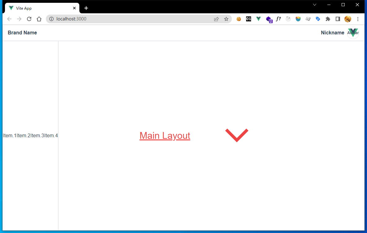
4-5
So let's add flex-col to Menu's root div to make one menu item take one row.
Remove justify-center from Menu.vue to make the menu item float at the top of Menu component.
Remove items-center from Menu.vue and remove text-align: center; from App.vue
We also remove to make the menu item float at the left of Menu component.
src/components/Menu.vue
<template>
  <div class="flex w-48 border flex-col">
    ...
  </div>
</template>
...
src/App.vue
<style>
#app {
  ...
  /* text-align: center; */
  ...
}
</style>
Now the left side menu looks like this:
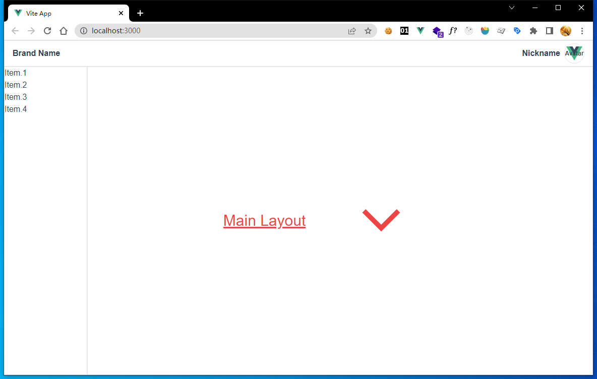
4-6
As you can see, only level 1 nodes been rendered, sub menus do not display.
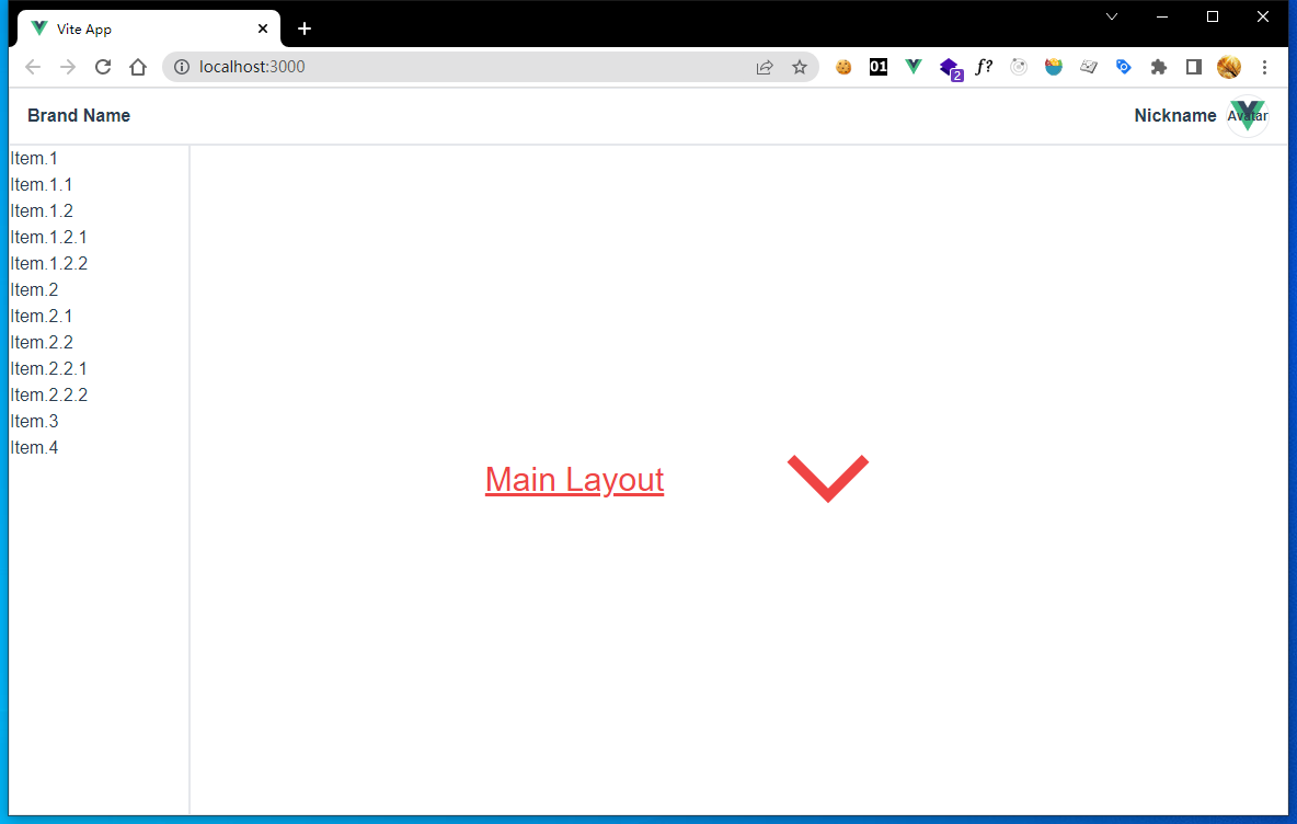
We should add nested MenuItem like this:
src/components/MenuItem.vue
<template>
  <span>{{ itemData.label }}</span>
  <MenuItem
    v-for="item in itemData.children"
    :key="item.key"
    :item-data="item"
  />
</template>
Now all menu items show up.
4-7
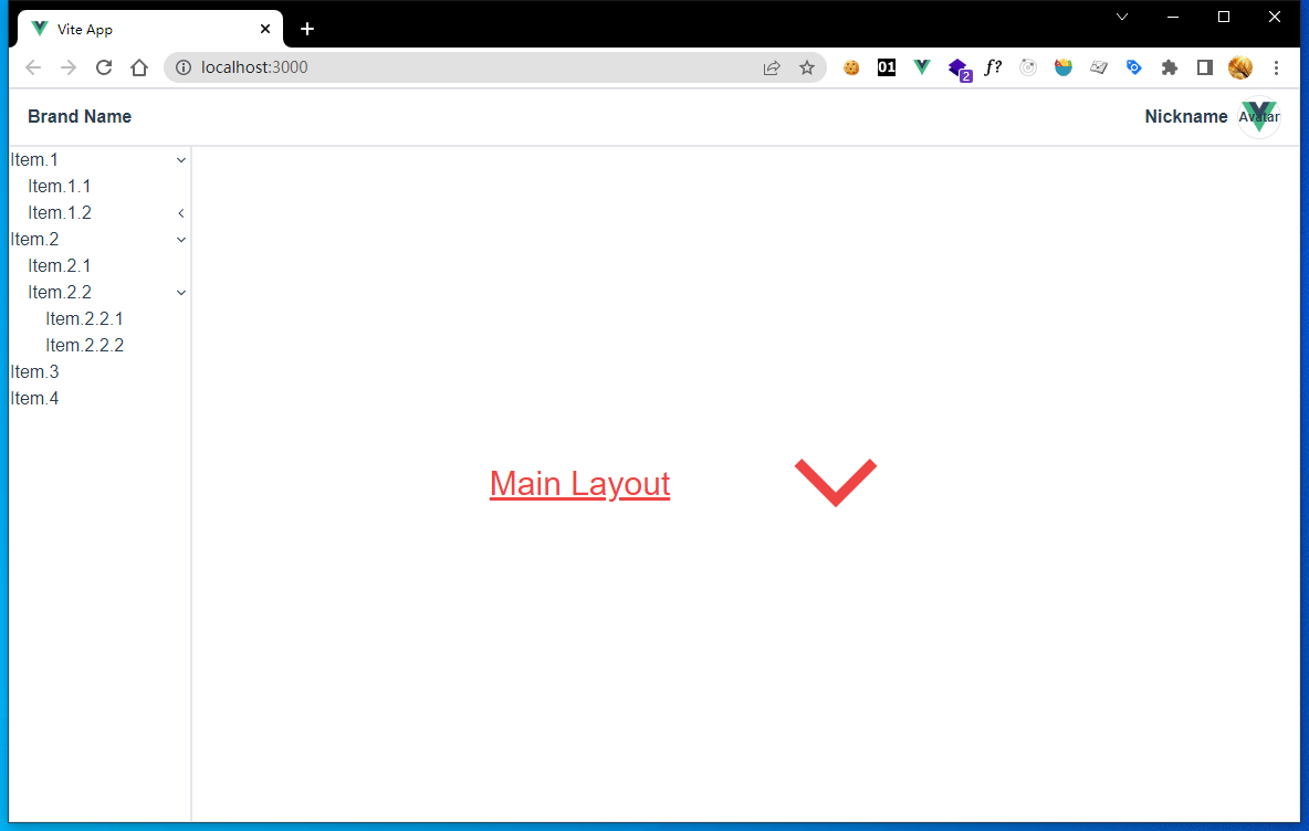
Add Indentations
Add indentations to menu items make them look nice. Adding a level property to MenuItem component will help a lot.
src/components/MenuItem.vue
<template>
  <div class="flex">
    <div
      :class="`flex ${
        ['', 'w-4', 'w-8', 'w-12', 'w-16', 'w-20', 'w-24', 'w-28'][level]
      }`"
    ></div>
    <span>{{ itemData.label }}</span>
  </div>
  <MenuItem
    v-for="item in itemData.children"
    :key="item.key"
    :item-data="item"
    :level="level + 1"
  />
</template>
<script>
export default {
  name: 'MenuItem',
  props: {
    ...
    level: {
      type: Number,
      default: 0,
    },
  },
};
</script>
We use :level="level + 1" to add more indentations to sub menus.And we use an array of eight classes to set corresponding width of different levels, which is ['', 'w-4', 'w-8', 'w-12', 'w-16', 'w-20', 'w-24', 'w-28'], only support eight levels of nesting.
Why we do not use dynamic class names like w-{4*level}? Because tailwindcss can not parse dynamic class names.The official explanation is here:
https://tailwindcss.com/docs/content-configuration#dynamic-class-names

4-8
Add Expanse and Collapse
If a menu has submenus, expanse and collapse make submenus show and hide as wanted.
src/components/MenuItem.vue
<template>
  <div class="flex" @click="clickMenuItem()">
    ...
  </div>
  <div v-if="expand">
    <MenuItem
      ...
    />
  </div>
</template>
<script>
export default {
  ...
  data() {
    return {
      expand: false,
    };
  },
  methods: {
    clickMenuItem() {
      this.expand = !this.expand;
    },
  },
};
</script>
Here we do is:
- add
expandproperty toMenuItemcomponent, set its tofalse - add
clickMenuItemmethod toMenuItemcomponent, negateexpandevery time the method is called. - wrap child
MenuItems in adivelement and bind itsv-ifdirective toexpandproperty. - bind the
clickproperty ofMenuItem's rootdivelement, toclickMenuItemmethod.
Now, preview the page, click menu item that has submenus to expand them, and click again to collapse them.

4-9
As usual, we need somes icons to show if menus have submenus.Let's add icons.
Thanks for the SvgIcon component we had created previously, it is easy to add icons.
Again, we can get icon from Google fonts:
Search arrow left download Keyboard Arrow Left with default Customization.Move it to src\assets\icons folder.
Then, edit MenuItem.vue.
src/components/MenuItem.vue
<template>
  <div class="flex items-center justify-between" @click="clickMenuItem()">
    <div class="flex">
      <div
        :class="`flex ${
          ['', 'w-4', 'w-8', 'w-12', 'w-16', 'w-20', 'w-24', 'w-28'][level]
        }`"
      ></div>
      <span>{{ itemData.label }}</span>
    </div>
    <div v-if="itemData.children && itemData.children.length > 0">
      <SvgIcon
        :name="
          expand
            ? 'keyboard_arrow_down_FILL0_wght400_GRAD0_opsz48'
            : 'keyboard_arrow_left_FILL0_wght400_GRAD0_opsz48'
        "
        class="w-4 h-4"
      />
    </div>
  </div>
  ...
</template>
Notice:
You need rerun
npm run devto enable new icons working.
What we do here is:
- add
SvgIconfollowing label element, render only ifitemData.children.length> 0. - if
expandis true, showKeyboard Arrow Down, else showKeyboard Arrow Left. - wrap label
spanelement and emptydivbefore it with an outerdivelement. items-centeralign elements in menu items vertically center.justify-betweenmakeSvgIconfloat at right ofMenuItem.
Preview your page, click side menus, you can find icons work well.
4-10
Add Styles
After we have completed basic works, it's time to add more detail styles.
src/components/MenuItem.vue
<template>
  <div
    class="my-menu-item"
    @click="clickMenuItem()"
  >
    ...
  </div>
  ...
</template>
<script>
...
</script>
<style lang="postcss" scoped>
.my-menu-item {
  @apply flex items-center justify-between h-12 cursor-pointer hover:bg-blue-100 hover:font-bold active:font-bold active:text-white active:bg-blue-600;
}
</style>
Here we use Scoped CSS to define a custom style class named my-menu-item,use @apply directive to add tailwindcss utilities:
h-12sets menu height toheight: 3rem; /* 48px */cursor-pointersets mouse cursor to pointer.hover:bg-blue-100sets the background color with a light blue when cursor hover.hover:font-boldsets text font bold when cursor hover.active:...sets text white and bold and makes background color blue after you pressed mouse.
Preview our page again,
4-11
Add Active Effect With Provide And Inject
You may found if you release your mouse, the active style disappear and only hover style remain.
As usual, we should keep active styles of menus after we clicked one of them, and switch to another menu if we click others.
We need state variable to record which node has been actived on the menu tree.
Here we don't want use state management now, we use provide and inject features provided by Vue, which designed for easily passing shared variable downside along trees.
First, we edit parent component Menu, provide a reactive state variable currentClickMenu which store current clicked menu's data, and provide a method onClickMenuItem called when some menu has been clicked.
src/components/Menu.vue
<script>
import { computed } from 'vue';
import MenuItem from './MenuItem.vue';
export default {
  components: { MenuItem },
  ...
  data() {
    return {
      currentClickMenu: null,
    };
  },
  provide() {
    return {
      onClickMenuItem: (e) => {
        this.currentClickMenu = e;
      },
      currentClickMenu: computed(() => this.currentClickMenu),
    };
  },
};
</script>
Then, use inject in MenuItem to declare variables that we want, onClickMenuItem and currentClickMenu, we can use them as they are MenuItem's own properties.
src/components/MenuItem.vue
<script>
export default {
  name: 'MenuItem',
  inject: ['onClickMenuItem', 'currentClickMenu'],
  ...
  methods: {
    clickMenuItem() {
      this.expand = !this.expand;
      this.onClickMenuItem(this.itemData);
    },
  },
};
</script>
Here we call onClickMenuItem and pass itemData to it, then all menu items know which menu has been clicked.
Reload our preview page , there will be some warnings:
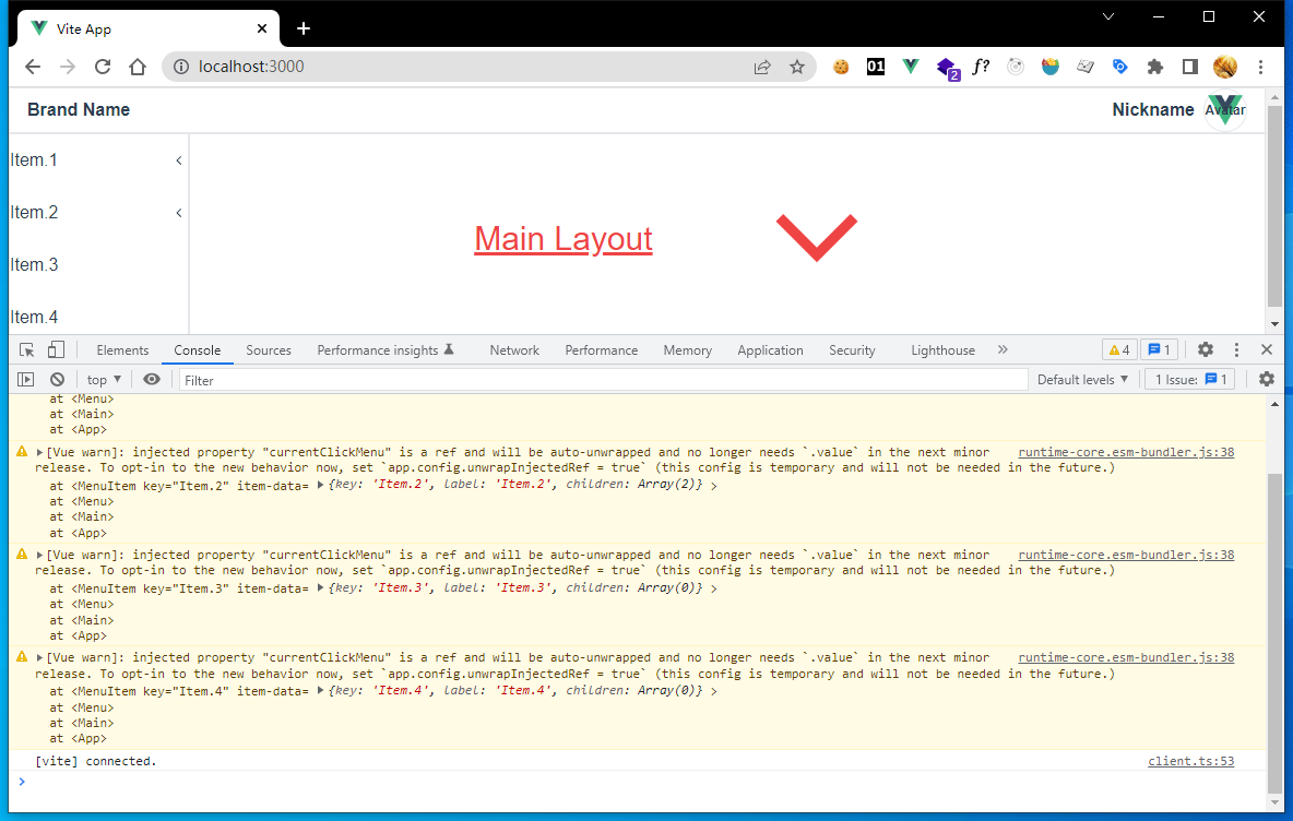
4-12
Do not be nervous, Vue's official document provide the tip:
Temporary Config Required
The above usage requires setting
app.config.unwrapInjectedRef = trueto make injections automatically unwrap computed refs. This will become the default behavior in Vue 3.3 and this config is introduced temporarily to avoid breakage. It will no longer be required after 3.3.
So, let's add the tiny config to main.js:
src/main.js
...
app.config.unwrapInjectedRef = true;
app.mount('#app');
Now the warning disappear.
If you want more information about provide and inject, visit https://vuejs.org/guide/components/provide-inject.html#working-with-reactivity
Let's continue our work.If we know which menu has been clicked, we can add actived style to that menu.
Edit MenuItem.vue file, add a computed property called active, bind to root div element's class attribute, and add active style of my-menu-item:
src/components/MenuItem.vue
<template>
  <div :class="`my-menu-item ${active? 'active' : ''}`" @click="clickMenuItem()">
    ...
  </div>
  ...
</template>
<script>
export default {
  ...
  computed: {
    active() {
      return (
        this.currentClickMenu &&
        this.currentClickMenu.key === this.itemData.key &&
        (this.itemData.children || []).length === 0
      );
    },
  },
  ...
};
</script>
<style lang="postcss" scoped>
.my-menu-item {
  @apply flex items-center justify-between h-12 cursor-pointer hover:bg-blue-100 hover:font-bold;
}
.my-menu-item.active {
  @apply font-bold text-white bg-blue-600;
}
</style>
Here we remove redundant active:... from my-menu-item.
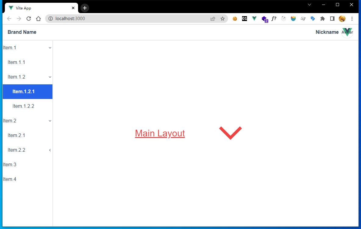
Now we click one leaf menu, it's active style takes effect, until we click another menu.
Emit Data To Parent Component
After so much works, aside menu now works well. If we use Menu as a component, it's useful to know which menu has been clicked by user.
So Menu component should emit the data of clicked menu outside to it's parent that use it, then we can use Menu like this:
<Menu :menu-data="someData" @click-menu="handleMenuClick()" />
Let's edit Menu.vue:
src/components/Menu.vue
<script>
...
export default {
  ...
  emits: ['clickMenu'], // declare event
  provide() {
    return {
      onClickMenuItem: (e) => {
        this.currentClickMenu = e;
        this.$emit('clickMenu', e); // emit clickMenu event
      },
      currentClickMenu: computed(() => this.currentClickMenu),
    };
  },
};
</script>
Here we declare an custom event clickMenu with emits option and emit clickMenu in onClickMenuItem.
Then edit src/layouts/Main.vue:
src/layouts/Main.vue
<template>
<NavBar />
<div class="flex h-full">
<Menu @click-menu="handleMenuClick" :menu-data="menuData" />
<div class="flex w-full justify-center items-center border">
<slot />
</div>
</div>
</template>
<script>
import NavBar from '../components/NavBar.vue';
import Menu from '../components/Menu.vue';
export default {
components: { NavBar, Menu },
data() {
return {
menuData: [
{
key: 'Item.1',
label: 'Item.1',
children: [
{ key: 'Item.1.1', label: 'Item.1.1', children: [] },
{
key: 'Item.1.2',
label: 'Item.1.2',
children: [
{ key: 'Item.1.2.1', label: 'Item.1.2.1', children: [] },
{ key: 'Item.1.2.2', label: 'Item.1.2.2', children: [] },
],
},
],
},
{
key: 'Item.2',
label: 'Item.2',
children: [
{ key: 'Item.2.1', label: 'Item.2.1', children: [] },
{
key: 'Item.2.2',
label: 'Item.2.2',
children: [
{ key: 'Item.2.2.1', label: 'Item.2.2.1', children: [] },
{ key: 'Item.2.2.2', label: 'Item.2.2.2', children: [] },
],
},
],
},
{ key: 'Item.3', label: 'Item.3', children: [] },
{ key: 'Item.4', label: 'Item.4', children: [] },
],
};
},
methods: {
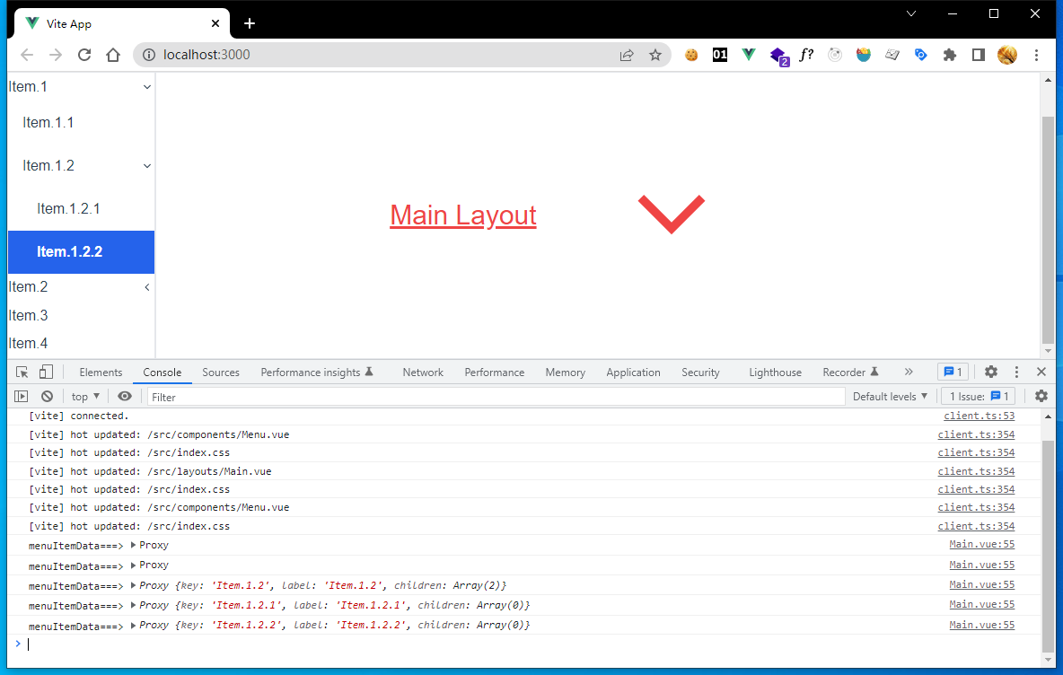
handleMenuClick(menuItemData) {
console.log('menuItemData===>', menuItemData);
},
},
};
</script>
Here we do is:
- create a method called
handleMenuClick, print data of clicked menu. - move
menuDatafromMenucomponent to this, then pass toMenuagain. - change default value of
Menu'smenuDatato[].
Now we have completed all the works on aside menu component.
4-13